Wednesday, April 10, 2024

Project Components

 I am proud to present...We Are Young: Here & Queer!

Documentary

https://drive.google.com/file/d/1ACENz9NJervsk3gmpDG1xvXmSTqgNTwl/view?usp=sharing

https://www.youtube.com/watch?v=rZokmM0bUYA

Magazine Spread

https://drive.google.com/file/d/1NrjTweFMq4eB-oeh8kuWMU7Jo9jNaswL/view?usp=sharing

Instagram

https://www.instagram.com/hereandqueerdoc/

Enjoy!

And one last quote before I go...

“The aromantic and asexual spectrums weren’t just straight lines. They were radar charts with at least a dozen different axes.”

- Alice Oseman, Loveless

Critical Reflection

We Are Young: Here & Queer is a documentary series about bringing awareness to young people in the LGBTQIA+ community with its excerpt highlighting themes of community, acceptance, awareness, and understanding. Through interviews detailing first-hand experiences and feelings garnered from being a member of the LGBTQIA+ community, the documentary shows how important it is to recognize queer youth and to uplift their voices as they are often underrepresented in society.

My excerpt of We Are Young: Here & Queer, highlights asexuality, an often underrepresented aspect of the LGBTQIA+ community. Along with interviews, the documentary utilizes other techniques such as B-roll, diegetic sound, music, and multiple angles and perspectives to tell Tasha's, the main subject of the excerpt, story. Each of these techniques proved vital in aiding my documentary's message. These techniques were also influenced by other documentaries that inspired me including Paris Is Burning (dir. Jennie Livingston) and Transhood (dir. Sharon Liese). These pieces inspired me in how I approached my project and how I tackled the topics presented in my documentary, which was especially prevalent in the interviews. In Transhood, interviews led the story by depicting how to subjects truly felt about what was happening in the world around them. This is also depicted in We Are Young: Here & Queer. By seeing the technique used in another documentary, I was able to see the impact it had and utilize it in my piece. While these documentaries have influenced the techniques I used to present my piece, I was also inspired by my research on the Queer Youth Movement which is documented on my blog. This research helped me fully flesh out my ideas and highlight the message of my piece, which is to bring awareness to queer youth and to bring LGBTQIA+ topics forward in a positive light. This research allowed me to do that. Through both aspects of my research, I was able to follow the conventions of the documentary genre and use techniques that elevated my piece while still sticking to the norms of the genre.
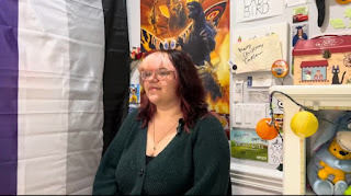

Through my research, I was also able to deduce the target audience of my documentary. We Are Young: Here & Queer is targeted towards a younger demographic of people of all genders aged ten to twenty-one, likely in or an ally of the LGBTQIA+ community and in the middle class. The documentary could also reach an older demographic of people aged between twenty-two and thirty-two, especially if they identify as members of or are activists in the LGBTQIA+ community. This demographic would also be interested in learning about LGBTQIA+ topics and are fans of other media with queer representation. 

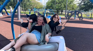
The target audience for my documentary directly correlates with the piece's representation. The main focus of my documentary is the LGBTQIA+ community, specifically teenagers. My excerpt highlights the personal struggles queer teens go through representing their identity, and how a strong bond with friends can be a great support system for someone to authentically express themselves. This is shown through interviews of the main subject and friends of theirs talking about their experiences with them. This is also shown through B-roll of the main subject having fun and spending time with their friends at a park. My excerpt also highlights asexuality. Asexuality is underrepresented in the media and when it is, it is usually shown in a stereotypical or sometimes mocking way. Most people, both in and out of the LGBTQIA+ community, don't really understand it, know what it is, or see it as a "valid" identity. By depicting a genuine account of real experiences from someone who is asexual, I am educating many on an unknown topic and giving a platform to speak about and uplift the experiences of those who may not otherwise be given a platform to speak on these important topics. My documentary is all about highlighting the queer community, being proud to express your identity, and showing others that they are not alone. By highlighting these underrepresented groups, I successfully developed my representation goals and showed society what it means to be a queer teenager.

My target audience and representation are also highlighted in We Are Young: Here & Queer's social media pages. My documentary uses Instagram as a promotional platform and YouTube for mainstream distribution. These social media platforms allow the documentary to be seen by and grow a platform with its audience. Instagram especially, gives an opportunity for the audience to engage and interact with the piece. The Instagram page further gives a behind-the-scenes look at the creative process, details what's coming next for the project, and promotes awareness for LGBTQIA+ topics. The Instagram page also offers a way for young queer people to share their stories and experiences and have them posted to the account. This makes the audience feel less alone and become more aware of what the queer experience is like which highlights the message of the piece. There are also phone wallpapers that the target audience can use to show their pride and express their identity through a device they use every day, which highlights the documentary's themes of identity and pride. 
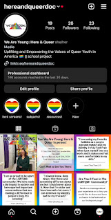

All aspects of my project, my documentary, my social media page, and my magazine spread, work together to create a brand of acceptance, community, and education about queer youth in society. Each aspect does this in different ways, but all share cohesive qualities. They represent equality and acceptance, promote awareness and education, and all use bright colors to convey an appealing and welcoming nature. Examples of this are the Instagram page spreading messages about important LGBTQIA+ ideas and using rainbow colors throughout the account. In addition, the magazine spread provides personal details on the impact of the brand, its message, and why it's so important to society. The documentary contributes to this by giving personal accounts of what it's like and showing the effects of what the brand promotes and the main theme of the brand. 

Through the creation of We Are Young: Here & Queer, I have learned so much about what it means to produce something so personal and impactful. I am very proud of this portfolio project, and that I created something that uplifts the many voices of my community, especially those that may not be the most talked about. I will take everything I learned from this process and evolve it for the future. 

Tuesday, April 9, 2024

Let's Look Back, Shall We

As we approach the end of this journey, I want to look back at my creation process and think about where I am now. I've known what I wanted to create since I heard about the project. As a member of the LGBTQIA+ community, I wanted to create something that made me and the members of my community feel seen in an authentic way. I also wanted to highlight underrepresented groups, especially those in the LGBTQIA+ community, like asexuality to bring more awareness to them. This is exactly what I did and I'm so proud of myself for that.

On the production side of things, I think I did everything pretty efficiently. I did thorough research on my topic and watched documentaries such as, Paris Is Burning and Transhood, to get a good idea as to how to approach my topic. I also planned efficiently to get everything done on time. With some changes along the way, I managed to hit that goal as well. On the filming side of things, it got a bit trickier. I filmed the main interview with no problem. I had appropriate questions, filmed in a timely manner, and got great responses. The problem occurred when it came to the B-Roll. Because I was so limited, with what I could do, it was hard for me to find things to film, even when listening to Tasha's responses. I ended up getting a lot of footage of them talking with their friends but the first time I got footage, it was practically unusable because the lighting was so bad. The interview also ended up being too short so I set up another day of filming more interviews with other friends of Tasha's and going to the park to get B-roll footage and this was immensely successful and vital to my project. Editing was also a bit of a struggle. I got a grove quickly but kept running into technical problems with my clips and software which took up a lot of my editing time. Once it was resolved (after a lot of troubleshooting), I finished my project efficiently. The constructive feedback from my peers was the most crucial part of my project. Without it, my project wouldn't have been as perfect as it is. Their feedback was very helpful in my final project.

The other components, the social media page, and the magazine, came together well but weren't without its few hiccups. The main issue for both was my lack of timing. For my social media page, although I created a posting schedule, it was very hard for me to stick to it and that caused me to be very behind. I wasn't posting as regularly as I should've been and fell behind on posts. This has caused me to catch up at the end, which I have done but has caused more stress. I also should've written the story for the print component sooner. This is because I didn't anticipate formatting to take as long as it did. I had to restart the formatting several times before getting it right, which was frustrating and would've been easier to navigate if I had given myself more time. 

Overall, even with all the bumps in the road, I am very happy with what I have created. I am very excited to share it and I can't wait for everyone to see it!


"I live proudly in a body of my own design. I defend my right to be complex."

—Leslie Feinberg, Trans Liberation: Beyond Pink or Blue, 1998


Sunday, April 7, 2024

I Completed the Print Component!

As you can probably tell from the title, I finished my magazine article! I am so excited I am one step closer to releasing my portfolio project into the world for people to see! Creating this magazine article proved to be a bit more difficult than anticipated, and not in the way I expected, let me explain.

In a previous blog post titled, "Starting the Print Component" (linked here), I started talking about ideas for the magazine article and the different templates from Canva I was going to use. This was me just planning but it was time to get started. My first step after planning was to write the story. This part came together quicker than I expected once I knew what I was going to write about. I decided to change the subject of the article. It was going to be topic-based but I decided to make it more director-focused. I did this because I felt it made the article feel more personal and gave more of an emotional insight as to the purpose and theme of the piece. I began planning the structure and the questions and I finished writing in no time! 

My planning notes

Once I was done writing, I let my dad proofread it for errors and redundancies and he gave me a lot of good notes. After we reviewed the notes together, I read through it one final time and decided it was done. Now came the formatting. This is the unexpectedly difficult part. Because I had written the story in a different document, it was hard to place the paragraphs properly into the templates, especially with the small font they provided. I chose one new template, made the font a bit larger so it was easier to read, and added the frames for the photos. After a lot of rearranging, I finally got it to look right. After that, I added the proper photos and added the small details such as the page number and making sure all of the text was left-aligned. Once those details were finished, the entire spread was done!


My dad’s notes

I really enjoyed writing and sharing my personal feelings on my documentary. I feel it makes the piece feel really personal and highlights how hard I worked and what this project really meant to me. The final product will be revealed in just a few days so keep your eyes peeled!


“Race, gender, religion, sexuality, we are all people and that’s it. We’re all people. We’re all equal.”

― Connor Franta

Thursday, April 4, 2024

Making Changes

As mentioned in the last blog post, during the group meetings I got a lot of great feedback on how to finish my documentary and changes I could make to improve it. I took those changes into account and now I can finally say my documentary is complete! In this blog post, I am going to detail what my exact process was for making those changes. 

My first step was the smaller stuff. I started by fixing the transition between interviews. I got rid of the fade I had previously used and took Ace's advice. I lowered the volume on the b-roll and started the interview voiceover sooner. This also helped with another issue in that sequence. There was a cut I had to make so ending the voiceover and showing the interview at that cut made the transition and the interview much smoother. I also zoomed in on the phone footage and although it's still not the most clear, it is definitely better and more visible. The last small thing I cleaned up was an obvious cut at around the fifty-second mark and just switched to the other angle, which made it look cleaner and more cohesive. 

Now it was time for the bigger changes. The first big change I tackled was finding music. This was the one that stressed me out the most. As mentioned in my blog post, "Listening To Music" (linked here), I found two songs but did not like the way they fit into my piece. But as music was becoming a more suggested comment, I knew I had to find something. I used the website Isa recommended which ended up working very well. It took me a while to find something I liked but when I did, it was unavailable due to me not having a premium account for the website. This was very frustrating but after looking around for about twenty minutes, I found something I liked and thought would work. I downloaded it, put it onto my timeline and it fit perfectly. It was neutral but also still conveyed a serious yet uplifting tone. I lowered the volume so it was still heard but not the main focus of the piece. I made cuts and added more music when necessary to make it flow well throughout the piece. Adding music was a great move and made the piece more cohesive. The song I used is linked here

Another addition that made the documentary more cohesive was adding a title card. I first tried Ace's technique of starting from a black screen with the voiceover as an audio bridge to transition to the interview but I hated how it looked. Because of this, I figured I would give Canva another try and it worked. Instead of creating the title card I had originally envisioned which was a rainbow flowing across the screen with the text behind it, I decided to use my logo. I added animation to the different aspects of my logo, particularly the rainbow and the text. I made it so the rainbow would move down and the text would move across. Although it isn't what I initially pictured, it still worked to create a solid introduction and highlight that my documentary starts from the beginning of the episode. 

My title card

I exported the project and sent it out again for some final feedback, but everything was all good! I am so excited that the main component of my project is finally complete! I am going to continue working on the print component and start thinking about the questions for my critical reflection. Wish me luck!

"Love who you want to love, and do it unapologetically, including that face you see every day in the mirror."

- George M. Johnson, All Boys Aren’t Blue

Tuesday, April 2, 2024

Group Meetings: A Finale

We had our final group meetings in class today! My group was almost the same as the previous, Ace, Samantha, Isabella, Dana, and Lauren but we were missing Mya. As a group, we were very productive and gave each other great feedback and suggestions for going forward with our projects. In this post, I am going to detail what happened during our group meetings, the feedback that was given to me, and how I am going to move forward with it. 

We started by talking about our print components. Ace, being the only one doing a short film, had a post card and was starting his postcard now that he finished editing. Isabella had finished their story but was struggling with the layout of the spread so we all gave her ideas on how to improve it and make it more dynamic. I had started the template for my spread, but as mentioned in the previous post, I haven’t started the story yet. Most hadn’t started it yet as they were still editing, which turned our focus to social media. Most were struggling to come up with ideas for posts, so we all helped each other out. We each gave suggestions for different posts that would work with their ideas and gave feedback on each others ideas, especially with audience engagement posts. 

After that, I began asking for feedback on the draft I had created for my episode excerpt. I got a lot of good ideas and suggestions on how to improve my piece. The most suggested ideas, I was already planning to incorporate, that being adding music and creating a title card. As mentioned in previous posts, I planned to include music but didn’t like what I chose. So, I waited for feedback to see if the piece needed it, and it very much does. That is something I am going to add when I continue to edit and Isa gave me the suggestion of using thematic.com so I am going to take that into consideration for sure. I also knew I wanted to add an introduction of some sort and I have an idea of what I want it to be. However, I am unsure on how to execute it. I had suggestions to use Canva, but I already tried and I was unable to create my desired vision. Ace also said I could even start from black and use the voiceover as a sound bridge as a transition, which although is not ideal, may be my last resort option if I can’t create my desired title card. The alternate side angles were well received as was the B-roll which was great because they were two aspects I was kind of worried about. I was also given small corrections such as, zooming in on the clips of the middle school pictures on the phone and the Trevor Project website to make the content more clear and visible. Another correction I was given was to fade the text with the video when transitioning into the other interviews of Tasha’s friends or to alternatively use the voiceover as an audio bridge with the audio from the clip of the friends lowered which is what I am going to likely do as I like this transition better than the fade out I currently have. I was also told to incorporate the other angle at around forty-nine seconds as the cut I made was too obvious. The feedback and constructive criticism I received was very helpful and will help me improve my project immensely.

We ended by watching Ace’s piece and giving feedback on it. His piece was incredible and put together so well! The story was really cool and unique which made the piece even better. We also talked about trailers and teasers, and how we could include them in our social media page. I plan to do a small teaser using some interview footage and B-roll with a piano cover, played by me, of We Are Young by fun. which is the song my title is based on. This group meeting was very constructive and I got a lot of useful information from it. I cannot wait to continue with this project and present my final results!

“But the truth is, also, simply this: love is indomitable.”

- Casey McQuiston

Saturday, March 30, 2024

Starting the Print Component

 Now that most of my editing is complete and I am continuously working on my social media page, I want to begin work on the print component of my project. As mentioned in previous blog posts, the print component for the documentary excerpt is a magazine spread. In my research about the magazine spread (linked here), I talked about what ideas I had for my own spread. In this blog posts, I am going to being to bring those ideas to life. 

I started looking on a creation platform that I am very comfortable with and that was recommended for me to use by my advisor Mrs. Stoklosa. This platform is called Canva. With Canva, you can pretty much create anything from posters, instagram posts, flyers, and even magazine covers and spreads. Canva has templates for your various projects so, I began to look for magazine spread templates. I found two that I liked, both for fashion magazines. I liked the placement of photos and text for both so I combined each page to create my two page spread. I rearranged some of the text and photos for the second page to add a large quote and more photos which will make my spread more varied while still having conventions of a typical magazine spread. 

This is the template I chose for the first page of the spread

This is the template I chose for the second page of the spread

My next step is to look for photos. Because I am choosing to do a topic-focused magazine spread, most of the pictures are going to be of the subjects in my documentary excerpt. I also want to include pictures of pride flags and people waving them around proudly. Because I have not written the story yet, this is subject to change as the pictures will reflect what is being told but this is the general idea I have. I would also like for the spread to include a lot of color because rainbows are a big symbol of the LGBTQIA+ community. Creating this spread will tie my entire project together and will enhance the message of my documentary which is telling queer stories and uplifting LGBTQIA+ voices. 

“I believe all Americans who believe in freedom, tolerance, and human rights have a responsibility to oppose bigotry and prejudice based on sexual orientation.” 
— Coretta Scott King

Project Components

 I am proud to present...We Are Young: Here & Queer! Documentary https://drive.google.com/file/d/1ACENz9NJervsk3gmpDG1xvXmSTqgNTwl/view?...